Redesign of Murphy Solutions’ crisis management platform, enhancing usability, responsiveness, and clarity for users in high-stakes environments.

Redesign of Murphy Solutions’ crisis management platform, enhancing usability, responsiveness, and clarity for users in high-stakes environments.
What we found
The site wasn’t fully responsive, and users struggled with simple actions like “go back” or “show more.”
There was no central space for quick updates or internal communication.
Colors and icons felt inconsistent, giving the interface a “messy” look.
The Murphy Standard section overwhelmed new users while offering little to seasoned ones.
The mobile version lacked clear definitions for menus and interactions.
HOW WE TACKLED IT
We took a function-first approach, fixing what didn’t work before worrying about polish.
Every design choice was tested and discussed in weekly catchups with stakeholders
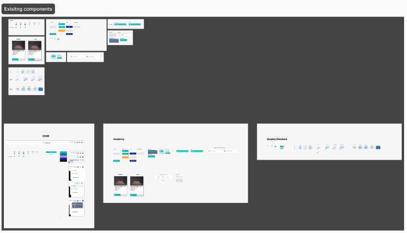
Audited current journeys and components to spot usability gaps and inefficiencies.
Recreated the component library for consistency, speed, and cross-platform use.
Applied the new system to rebuild end-to-end screens aligned with user needs and business goals.
Lets Start with mapping the components and the flows
We began by auditing all existing user journeys and interface components to understand how they connected. This revealed usability gaps, visual inconsistencies, and areas where the system failed to scale effectively.

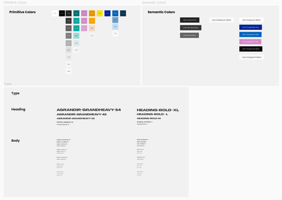
Building a scalable system
Using those insights, we rebuilt the component library from the ground up. Each element was made modular, brand-aligned, and adaptable, creating a foundation for consistency and faster collaboration across teams.
New Branding:
The new branding includes a new color scheme, typography, logo, motifs and other design components that can be used across various facets of Murphy Solution as a company and product.
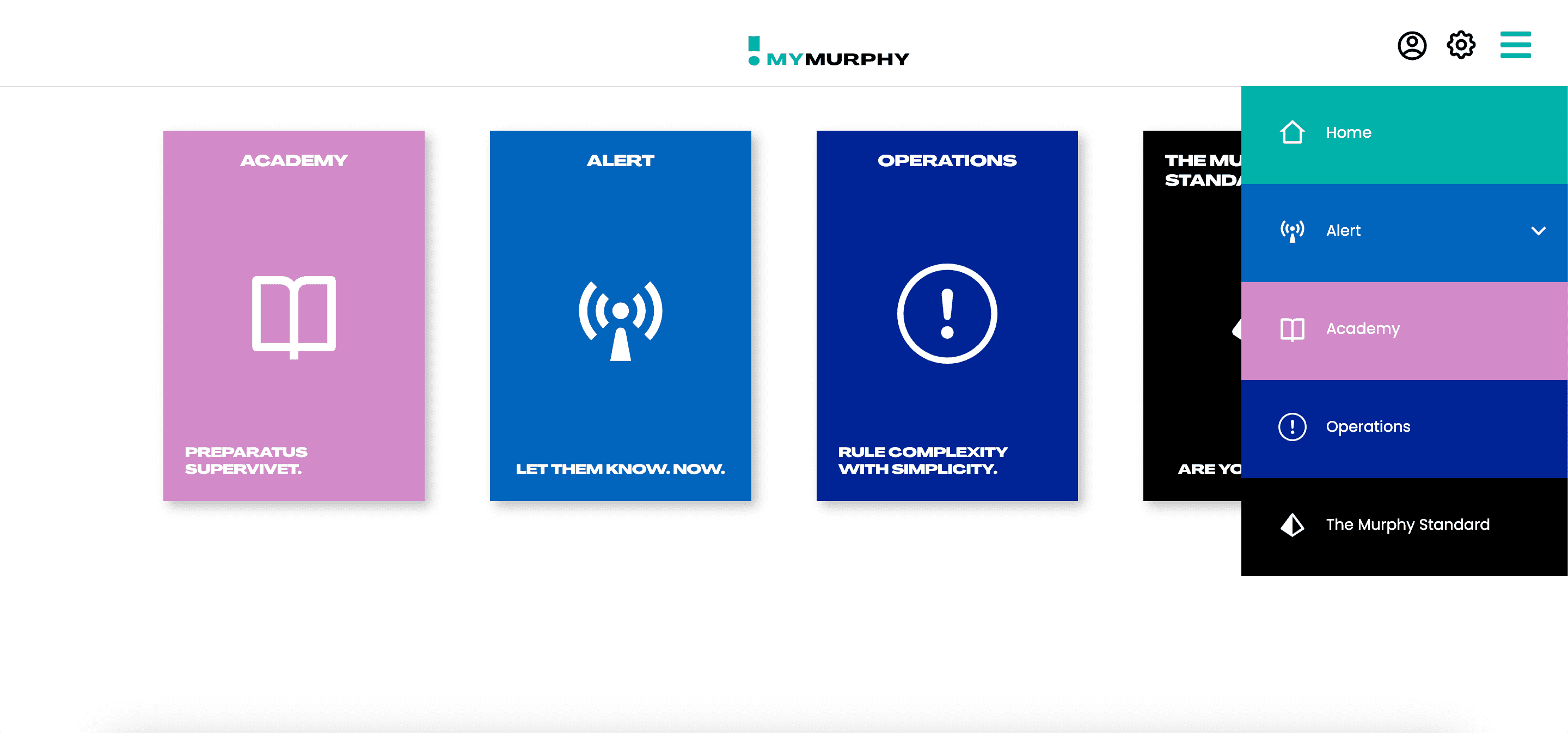
FINAL DESIGN
The experience is now structured, calm, and easy to navigate even under pressure.
The redesign went beyond visuals it transformed how the platform works and feels.

The information presented here is only for demonstration purposes and does not reflect the actual product.
VALUE GENERATED
The experience now feels structured and calm, even in high-pressure situations.
In the end, this project was about designing confidence, not just interfaces. Whether on web or mobile, users can act decisively and feel in control when it matters most.

